
The Anatomy of a High-Converting Contact Page
Is your contact page a dead end?
Most businesses treat this crucial page like an afterthought—slapping a generic "Name, Email, Message" form on a blank page and wondering why they only get spam or crickets. Your contact page should be a high-converting "Start Here" page!
It is the bridge between a casual browser and a paying client.
Here, I walk you through the anatomy of a contact page that actually converts. We cover why you need to show your face, the importance of clear next steps to protect your boundaries, and how to ditch the generic message box.
Plus, I’ll share real-world examples from a variety of businesses (service providers, coaches, and brick-and-mortar shops) to show you exactly how it’s done.
Level up with a CRM: https://youtu.be/5AK_3jgQ1hc
Transcript below!
-
00:00 treat their contact page like an afterthought. They spent so much time working out all of the words for your home page, for all of your services, for your key messaging, all the call to action buttons, you spent so much time thinking about it all, only to leave a generic name, email, message, form, and
00:24 email on your contact page with really nothing else. And then people wonder why they hear crickets or they get so much spam, um, or just tire kickers because people don't know enough on that page because they're probably not clicking to every single page of your website.
00:41 There's not enough on that page to make sure you're pulling in the right people and repelling the wrong ones. Your contact page should be a proper start here page, a work with me page.
01:02 something that bridges between a casual website viewer and to somebody who is ready to become a paying client or at least take the next steps to learn more to be, to do so.
01:14 If it feels clunky or if it feels, uhm, barren, people will likely leave. So here are my top tips for how to make your contact page convert.
01:35 And then at the end of this, I'm going to show you some really good examples. So let's talk about the tips and then get into those examples.
01:40 First, show your face. People want to know that they're talking to a real person, that they're buying from a real person.
01:47 So if you're a service-based or product-based, if you're a small business, show your face. So your team's face, show a picture of your, uhm, shop.
01:57 Just make sure it stays really visual and really human. Uhm, then you might have your contact form, but if you, then you might actually use that contact form, but it should be personalized a bit.
02:11 It should match your brand's tone, visuals, messaging, and have a little bit more information for you and for them. Thank Then give them an alternate option.
02:22 If maybe they're not ready to go dive into potentially being a client or they're looking to work with you in an alternative capacity or just partner with you in some way, it's good for you to have your email or phone number, uh, if you use one so that it, they can contact you without the pressure of
02:40 feeling like they have to go through the client only route. Um, additionally, make sure if you're using a form to use reCAPTCHA so you can keep it, your spam count down and spend less time clearing out your inbox.
02:54 If you have a physical location, make sure that your contact page has your hours, your location, your, and a map, so that people can find you.
03:13 Ahem, uhm, this is not only great for search engines, it's also great for, you know, for people being able to legitimately find you, know when you're open, and be sure to stick to those things.
03:24 Ahem, people check this, and so if you are closed early or something, people might become frustrated, so be really clear about your hours and your boundaries, but make sure to show people where to find you.
03:38 Speaking about boundaries, let's talk about this. This applies to all businesses, but make sure to have some really clear next steps.
03:45 So after they click send on that form, or they send you an email, what happens next? Ahem, so for me, you know, that might say, oh, I'll get back to you within a couple of business days, or it might be, ahem, you know, I, you'll get a form from me, whatever, whatever is next.
04:05 Make sure they know, and they know that the timeline and the next steps. And the other perk of that is by being really clear and upfront about that, you're also protecting your piece and your boundaries.
04:17 If you say, oh, you're not going to hear from me for a day or two, ahem, and they're, they're expecting to hear from you in a little bit, but not immediately, then you're going to get fewer fewer of those emails that are like, hey, I filled out a form and I still haven't heard from you when it's only
04:32 been an hour, right? And then your contact page should have one, one clear call to action. You shouldn't be meddling it up with too many other places they can go or other things they can do and other ways they can interact with you or interact with, uhm, or learn about you.
04:51 The main purpose of this page is to get them to take that next step. Come to your shop, buy one of your digital products to book that consultation call, whatever that really important next step is for the person to enter your world.
05:04 That is what this page is all about. So it should ask that in a few different places and maybe in a few different ways, but it should always be that one call to action.
05:13 So let's jump in and look at a few of these.
05:16 Alright, I've got 5 quick examples for you. So, these are all websites I've designed at one point or another. Most of them are fairly recent, so there you go.
05:26 This is my website, so I've got, drop me a line, and I've got a picture of me with a phone, because a lot of people would contact me that way.
05:33 I've got message away, and this opens to my email. This also opens to my email maybe a little more clearly.
05:40 And it says, I personally respond to every message from my home office. Uh, take the next step, book a chat below, right?
05:48 So, it's all very personal, very much my language. Then we've got, um, my CRM, and they can choose to meet in person, phone call, or via video.
05:57 And, so when they actually click into that, they can pick their date, their time, and I ask quite a few questions about what they're doing.
06:04 So, you can see I've got a pretty detailed form here. And this is through my CRM, and we can talk more about that shortly.
06:12 And then I've got the simple system I've used to build 100 plus websites, book a free chat, lock in your spot, design and development, and launch.
06:20 And I don't have a, I'll get back to you in 48 hours thing, mostly because they know exactly what day we're meeting, because they've chosen it.
06:27 So that's mine. My home, uh, contact page. And this page is linked to in lots and lots of places of my website.
06:34 Um, lots of calls to actions lead to this page, and I want it to feel really personable and relatable. Sometimes I like to put on a contact page, um, image that's like really front-facing, where they can see me smiling, and sometimes I might switch that out at some stage.
06:48 But I kind of liked the, with the phone vibe. Stefan is, we've just revamped her whole website, and it's so, so beautiful.
06:57 And, so she's got not pictures of herself, but pictures of weddings she's done, because she's a photographer. And a bit about, um, you know, some really good SEO words in here.
07:08 She then has a what happens after you inquire. And, you know, the one, two, three, four things they can expect.
07:16 Um, more pictures of weddings she's done, and got some expectations about where she serves. And that's both good for the clients and for SEO.
07:27 And then she's got her form. And hers is also connected to her CRM, which is a different one that's photography specific.
07:33 And she collects some good information about what type of photo shoot they're looking for, what, where they're looking for, what date they're looking for.
07:40 Et cetera. Once they fill that out, um, you know, they get a thank you, we'll be in touch kind of message from her.
07:48 Um, as then we have a, some reviews and those are pulled directly in from her Google reviews. And so there's some trust building there, um, as well.
08:02 This is a property management website, and when you click this apply now button, it takes you to how to apply for a home.
08:08 And we found this great fixture that's green and staged. And it's got this, this is our four step process, right?
08:16 Complete the application online. We're going to screen it. You're going to apply, you get approved, you're going to get a deposit, you will sign your lease and move in.
08:24 And so we've got download your application, and then here's how to submit it. And they've pretty simple with a PDF and a Dropbox, um, because they're a pretty small business and they didn't need all the bells and whistles.
08:34 And then we've got, and this is in their footer for every single, uh, page, but they have their hours, their phone number and their address for everyone to get in touch.
08:48 A lot of these businesses, I work with a lot more service space businesses that have, um, brick and mortar, but I will show, make sure to show you a couple more brick and mortar options.
08:58 This is a, uh, coach, um, and so she's got a little bit of, again, about the why and the emotive side of what it's like to work with her.
09:08 And then she's got her step one, step two, step three. Um, and then she's got her two offers, both of them kind of encouraging Thank watching.
09:16 Joining the wait list for one, because it's not available yet. And then that's why it's a little bit lower down and then book a free consultation.
09:24 And that links to her, um, paperbell where she can book, people can book and they've got, from there, she has those things we talked about, frequently asked questions and all sorts.
09:39 And this is another coach that I wanted to show you this one, because it's an interesting example, because he has a one-page website, but we've made sure to still have, um, anchor links that take you to various parts of the pages.
09:54 And so when you click contact here, it scrolls you down to, are you ready? And he still has a very simple version of all of this.
10:01 Step one, step two, step three. I want to work with you. Contact me. So a few different ways. Um, again, because his is a one-pager, it is a bit different where you might, um, not have as, you do have more calls to action than you would on a standard one of these.
10:19 And the last one I want to show you is another example of brick and mortar. This is Sagehens, and I'm going to zoom in.
10:27 So you can see what this looks like on a normal page. My screen's huge. And so they've got a pretty simple website, but they've got visit us and historic downtown Pendleton.
10:35 So we've SEO optimized this and they've got their shop location, their hours, an interactive map, and their email address. So there's lots of ways for people to get in touch.
10:45 They can either pop into the shop, they have their email address. They don't currently have a business phone number. Um, but if they were to add one of those brutal.
10:53 I want to add that to that page. So there's some examples for you.
10:56 And just a couple quick bonus tips for you, so once you've nailed all of this and you've got your custom contact page that really reflects your business, but also gives your customers exactly what they need to take that next step with you, uhm, think about what you can do to even level it up a little
11:12 further. So, two ways to level it up further, one would be once someone hits that submit form, submit button on your form, uhm, what happens next?
11:20 Do they just get a, thank you, we'll be in touch, message sent? Or can you set up a redirect page where when they submit that form it's, thank you so much for your message, we'll be in touch soon, while you're waiting, and then some resources, so it might be, take a look at our blog, you might find these
11:38 articles helpful, or here's my podcast, or here's a free resource for you, uhm, that will help them stay in your world and get to like, know, and trust you and your business even more.
11:49 The other level up is, and we touched on this before, is instead of using just a standard contact form, is to use one that is in a CRM, which is a Client Relationship Management Software.
12:02 And, so, there's lots of these out there, I used Upsado for my business and with a lot of my clients, And I have videos on that, so I'll make sure to link a couple.
12:10 But, then you can automate things. So, right, when they book that call or fill out that form, what happens next?
12:17 You don't really have to worry about it. They get an email, they get the next steps, they get everything automatically and you're not having to go and manually do that.
12:26 So, those are your two level ups. Um, I hope that this is a, I hope that this has been really helpful and allows you to create a good contact page that helps protect your time, filters out the people who aren't, uh, great fit clients for you and welcomes the right ones with open arms.
12:46 Make sure to like, subscribe and share this video if you have found it useful.
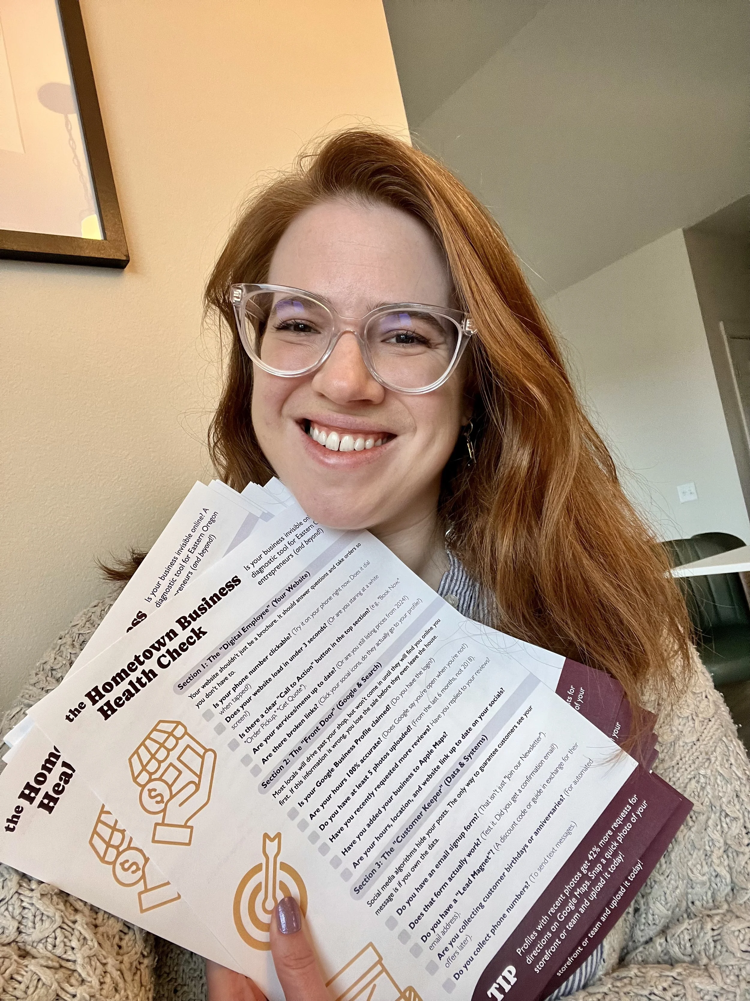
Is your business invisible online?
Most locals won't visit your shop until they find you online first. If your digital "Front Door" is broken, you lose the sale before they even leave the house.
Take 5 minutes to diagnose your digital presence with the Hometown Business Health Check 👇


So, you built the website, you launched the business... and now you're wondering why the hell it isn't making any sales. We are breaking down the most common trip-up points that are actively causing your website to leak leads and lose customers.